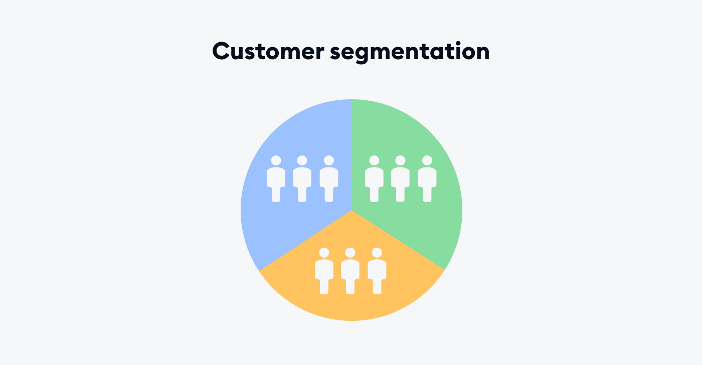
This project segments customers using K-Means clustering and PCA (Principal Component Analysis). It generates synthetic customer data, runs clustering, and shows results as an interactive scatter plot using Plotly.
Features
- Generate sample customer data
- Perform K-Means clustering
- Apply PCA for 2D visualization
- Create interactive Plotly scatter plots
- Includes a Jupyter notebook for exploration
This project demonstrates a practical introduction to customer segmentation using unsupervised machine learning techniques. It leverages K-Means clustering to group customers based on behavioral patterns and applies Principal Component Analysis (PCA) to reduce dimensionality for clear, two-dimensional visualization. To keep the project accessible and self-contained, synthetic customer data is generated programmatically. The final output is an interactive Plotly scatter plot, allowing users to visually explore customer clusters and better understand how segmentation works in real-world analytics scenarios.
Designed as a beginner-friendly learning project, the solution includes a clean modular structure, a runnable command-line interface, and an exploratory Jupyter notebook for hands-on analysis. Users can easily adjust the number of clusters, run tests to validate functionality, and view results directly in a browser via generated HTML visualizations. Overall, this project serves as a solid foundation for learning Python-based data analysis, clustering concepts, and interactive data visualization workflows.